Tutorials · English
Skyscraper editorial format · verified 4 November 2026
AI brand monitoring dashboard: separate mentions from recommendations
A useful dashboard keeps observation types separate. Mentions, recommendations, citations and conversions answer different questions and should not be collapsed into one score.
Key takeaways
How to design an AI brand monitoring dashboard that teams can interpret and act on.
- How to design an AI brand monitoring dashboard that teams can interpret and act on.
- Define the decisions the dashboard must support and the audience for each view.
- Add a change log and review cadence so the dashboard remains comparable over time.
- A weekly view can show recommendation rate for purchase prompts next to qualified signup events, while keeping the two systems’ evidence separate.
- Dashboards can hide sampling and denominator changes.
How to design an AI brand monitoring dashboard that teams can interpret and act on.
- 1Define the decisions the dashboard must support and the audience for each view.
- 2Create separate measures for mention rate, recommendation rate, citation share and competitor presence.
- 3Show denominators, question intent, market, language, model and collection date beside every rate.
- 4Link observations to Search Console and GA4 outcomes without claiming that one caused the other.
- 5Add a change log and review cadence so the dashboard remains comparable over time.
A weekly view can show recommendation rate for purchase prompts next to qualified signup events, while keeping the two systems’ evidence separate.
Limits
- Dashboards can hide sampling and denominator changes.
- AI observations and analytics outcomes have different time windows.
- A single score can oversimplify important context.
How to interpret the result
AI brand monitoring dashboard: separate mentions from recommendations. This is a decision workflow, not a checklist of isolated settings. Read each observation against the original question, the public output and the expected user or crawler behaviour.
Interpret the observation in context
How to design an AI brand monitoring dashboard that teams can interpret and act on. Start with the exact scope, then compare the observed value with the expected value. A green status can confirm one technical observation while leaving indexation, ranking or conversion unanswered.
Context before conclusion
A weekly view can show recommendation rate for purchase prompts next to qualified signup events, while keeping the two systems’ evidence separate.
A practical operating note
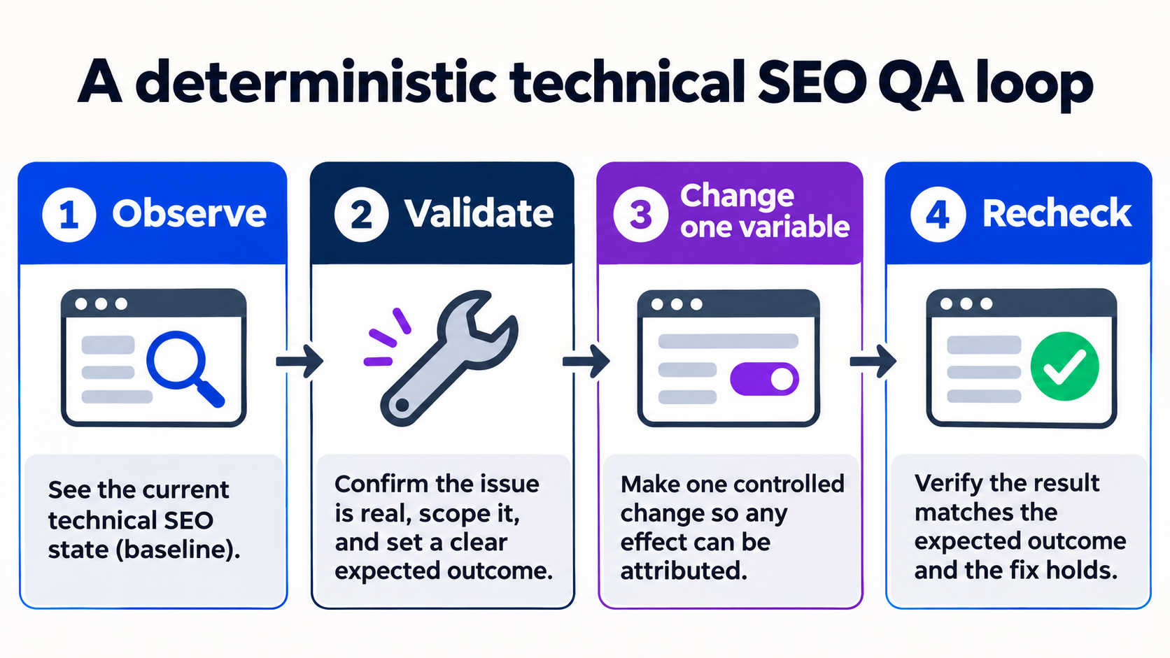
Use this as a decision record: define the question, inspect the live output, make one controlled change, and recheck the same evidence. That sequence keeps diagnosis separate from assumptions. Make the smallest reversible change possible and keep the previous value. This protects the page from accidental regressions and gives another specialist enough context to reproduce the review.
Quality gate
Dashboards can hide sampling and denominator changes.
What to measure next
Record the exact URL or property, the date, the tool state and the visible output. Repeat the same check after the change and compare like-for-like values instead of relying on a single screenshot.
Next observation
Add a change log and review cadence so the dashboard remains comparable over time. Keep the result separate from traffic, ranking and revenue claims until those outcomes are measured in their own systems.
The step-by-step workflow
Use this as a decision record: define the question, inspect the live output, make one controlled change, and recheck the same evidence. That sequence keeps diagnosis separate from assumptions.
Define the decisions the dashboard must support and the audience for each view.
Why it matters
Start by writing down the exact question and scope. A precise question prevents the workflow from drifting into unrelated checks.
Create separate measures for mention rate, recommendation rate, citation share and competitor presence.
Why it matters
Validate the live output before editing anything. This creates a baseline and separates a real defect from a reporting delay.
Show denominators, question intent, market, language, model and collection date beside every rate.
Why it matters
Check the surrounding signals that can explain the observation. Compare like-for-like values instead of relying on one screenshot or status label.
Link observations to Search Console and GA4 outcomes without claiming that one caused the other.
Why it matters
Change one variable at a time and record what changed. Controlled changes make the next observation attributable and reversible.
Add a change log and review cadence so the dashboard remains comparable over time.
Why it matters
Recheck the same evidence after the change. Record the timestamp and outcome so the result can be reviewed later.
Intent
Evidence
Controlled change
Recheck
Evidence and implementation notes
A weekly view can show recommendation rate for purchase prompts next to qualified signup events, while keeping the two systems’ evidence separate.
Capture the exact URL or property, timestamp, expected state and observed result. Keeping those fields together makes the work reproducible and easier to hand off.
intent: How to design an AI brand monitoring dashboard that teams can interpret and act on.
language: en
evidence: official-tool workflow + local QA
status: reviewable tutorial| Check | What to capture | Why it matters |
|---|---|---|
| 1. Define the decisions the dashboard must support and the audience for each view. | Exact value, URL, timestamp and visible status. | Preserves a reviewable baseline before and after a change. |
| 2. Create separate measures for mention rate, recommendation rate, citation share and competitor presence. | Exact value, URL, timestamp and visible status. | Preserves a reviewable baseline before and after a change. |
| 3. Show denominators, question intent, market, language, model and collection date beside every rate. | Exact value, URL, timestamp and visible status. | Preserves a reviewable baseline before and after a change. |
| 4. Link observations to Search Console and GA4 outcomes without claiming that one caused the other. | Exact value, URL, timestamp and visible status. | Preserves a reviewable baseline before and after a change. |
| 5. Add a change log and review cadence so the dashboard remains comparable over time. | Exact value, URL, timestamp and visible status. | Preserves a reviewable baseline before and after a change. |
Common mistakes to avoid
The most expensive errors come from changing several variables at once or treating a tool status as a business outcome. Use each limitation below as a quality gate before publishing a conclusion.
1. Quality gate
Dashboards can hide sampling and denominator changes.
2. Quality gate
AI observations and analytics outcomes have different time windows.
3. Quality gate
A single score can oversimplify important context.
Frequently asked questions
What is the fastest safe way to start?
Use this as a decision record: define the question, inspect the live output, make one controlled change, and recheck the same evidence. That sequence keeps diagnosis separate from assumptions. Define the decisions the dashboard must support and the audience for each view.
Does a successful check guarantee a business result?
A weekly view can show recommendation rate for purchase prompts next to qualified signup events, while keeping the two systems’ evidence separate. Dashboards can hide sampling and denominator changes.
What should I record for a repeatable review?
Capture the exact URL or property, timestamp, expected state and observed result. Keeping those fields together makes the work reproducible and easier to hand off. Add a change log and review cadence so the dashboard remains comparable over time.
Talk to an expert
Want this workflow applied to your site? Talk to a ViziGEO expert for a practical next step and a reviewable evidence baseline.